Do regional climate models add value compared to global models?

2016-05-20 10.08.17

Global climate models (GCM) are designed to simulate earth’s climate over the entire planet, but they have a limitation when it comes to describing local details due to heavy computational demands. There is a nice TED talk by Gavin that explains how climate models work.

We need to apply downscaling to compute the local details. Downscaling may be done through empirical-statistical downscaling (ESD) or regional climate models (RCMs) with a much finer grid. Both take the crude (low-resolution) solution provided by the GCMs and include finer topographical details (boundary conditions) to calculate more detailed information. However, does more details translate to a better representation of the world?

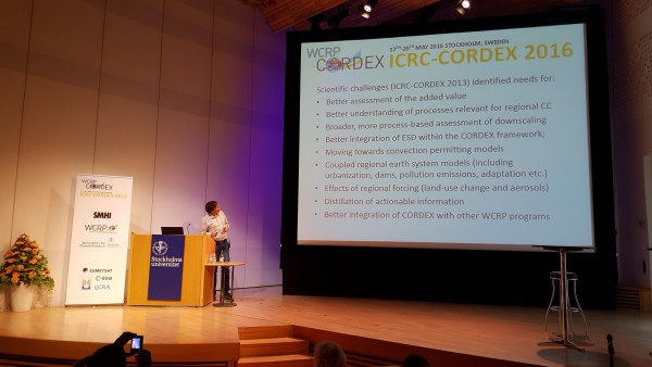
The question of “added value” was an important topic at the International Conference on Regional Climate conference hosted by CORDEX of the World Climate Research Programme (WCRP). The take-home message was mixed on whether RCMs provide a better description of local climatic conditions than the coarser GCMs.

RCMs can add details such as the influence of lakes, sea breeze, mountain ranges, and sharper weather fronts. Systematic differences between results from RCMs and observations may not necessarily be less than those for GCMs, however.  

There is a distinction between an improved climatology (basically because of topographic details influencing rainfall) and higher skill in forecasting change, which is discussed in a previous post.

Global warming implies large-scale changes as well as local consequences. The local effects are moderated by fixed geographical conditions. It is through downscaling that this information is added to the equation. The added value of the extra efforts to downscale GCM results depends on how you want to make use of the results.

The discussion during the conference left me with a thought: Why do we not see more useful information coming out of our efforts? An absence of added-value is surprising if one considers downscaling as a matter of adding information to climate model results. Surprising results open up for new research and calls for explanations for what is going on. But added-value depends on the context and on which question is being asked. Often this question is not made explicitly.

There are also complicating matters such as the varying effects that arise when one combines different RCMs with different GCMs (known as the “GCM/RCM matrix”) or whether you use ESD rather than RCMs.

I think that we perhaps struggle with some misconceptions in our discourse on added-value. Even if RCMs cannot provide high-resolution climate information, it doesn't imply that downscaling is impossible or that it is futile to predict local climate conditions.

There are many strategies for deriving local (high-resolution/detailed) climate information in addition to RCM and ESD.

Statistics is often predictable and climate can be regarded as weather statistics. The combination of data with a number of statistical analyses is a good start, and historical trends provide some information. It is also useful to formulate good and clear research questions.

I don't think it's wrong to say that statistics is a core issue in climatology, but climate research still has some way to go in terms of applying state-of-the-art methods.

I have had very rewarding discussions with statisticians from NCAR, Exeter, UCL, and Computing Norway, and looking at a problem with a statistics viewpoint often gives a new angle. It may perhaps give a new direction when the progress goes in circles.

There are for instance still missing perspectives on extremes: present work includes a set of indices and return value analysis, but excludes record-breaking event statistics (Benestad, 2008) and event count statistics (Poisson processes).

Another important issue is to appreciate the profound meaning of random samples and sample size. This aspect also matters for extreme events which always involve small statistical samples (by definition  – tails of the distribution) and therefore we should expect to see patchy and noisy maps due to random sampling fluctuations.

Patchy maps were (of course) presented for extreme values at the conference, but we can extract more information from such analyses than just thinking that the extremes are very geographically heterogeneous. Such maps reminded me of a classical mistake whereby different samples of different size are compared, such as zonal mean still found in recent IPCC assessment reports (Benestad, 2005).

There was a number of interesting questions raised, such as “What is information?Information is not the same as data, and we know that observations and models often represent different things. Rain gauges sample an area less than 1 m2, phenomena producing precipitation often have scales of square kms, and most RCMs predict the area average for 100 km2. This has implications for model evaluation.

When it comes to model performance, there is a concept known as “bias correction” that was debated. It is still a controversial topic and has been described as a way to get the “right answer for the wrong reason”. It may increase the risk of mal-adaptation if it’s not well-understood (due to overconfidence).

Related issues included ethics as well as a term that seemed to invoke a range of different interpretations: ”distillation”. My understanding of this concept is the process of extracting the essential information needed about climate for a specific purpose, however, such terms are not optimal when they are non-descriptive.

Another such term is “climate services“, however, there has been some good efforts in explaining e.g. putting climate services in farmers' hands.

Much of the discussion during the conference was from the perspective of providing information to decision-makers, but it might be useful to ask “How do they make use of weather/climate information in decision-making? What information have they used before? What are the consequences of a given outcome?” In many cases, a useful framing may be in terms of risk management and co-production of knowledge.

The perspective of how the information is made use of cannot be ignored if we are going to answer the question of whether the RCMs bring added-value. However, it is not the task of CORDEX to act as a climate service or get too involved with the user community.

Added-value may be associated with both a science question or how the information is used to aid decisions, and the WCRP has formulated a number of “grand challenges”. These “grand challenges” are fairly general and we need “sharper” questions and hypotheses that can be subjected to scientific tests. There are some experiments that have been formulated within CORDEX, but at the moment these are the first step and do not really address the question of added-value.

On the other hand, added-value is not limited only to science questions and CORDEX is not just about specific science-questions, but should also be topic-driven (e.g. develop downscaling methodology) to support the evolution of the research community and its capacity.

Future activities under CORDEX may be organised in terms of “Flagship pilot studies” (FPS) for scientists who want an official “endorsement” and more coordination of their work. CORDEX may also potentially benefit with more involvement with hydrology and statistics.

P.S. There is an up-coming article about downscaling in the Oxford Research Encyclopedia.

References


  1. R.E. Benestad, “A Simple Test for Changes in Statistical Distributions”, Eos Trans. AGU, vol. 89, pp. 389, 2008. http://dx.doi.org/10.1029/2008EO410002


  2. R.E. Benestad, “On latitudinal profiles of zonal means”, Geophys. Res. Lett., vol. 32, pp. n/a-n/a, 2005. http://dx.doi.org/10.1029/2005GL023652

Forest Digest – Week of May 16, 2016

old-growth forest

Credit: Yinghai Lu

Find out the latest in forestry news in this week’s Forest Digest!

AMOC slowdown: Connecting the dots

I want to revisit a fascinating study that recently came from (mainly) the Geophysical Fluid Dynamics Lab in Princeton. It looks at the response of the Atlantic Ocean circulation to global warming, in the highest model resolution that I have seen so far. That is in the CM2.6 coupled climate model, with 0.1° x 0.1° degrees ocean resolution, roughly 10km x 10km. Here is a really cool animation.

When this model is run with a standard, idealised global warming scenario you get the following result for global sea surface temperature changes.

Saba_Fig4

Fig. 1. Sea surface temperature change after doubling of atmospheric CO2 concentration in a scenario where CO2 increases by 1% every year. From Saba et al. 2016.

Most of the oceans got moderately warmer (green). The subpolar Atlantic got colder (blue). That’s the familiar response to a slowdown of the Gulf Stream System or AMOC (Atlantic Meridional Overturning Circulation), and that is also what the present paper attributes this to. Such a cooling of the subpolar Atlantic since the beginning of the 20th Century is actually observed, as we have discussed here.

And then there is a very large warming on the Northwest Atlantic shelf, the main topic of the paper. This is perhaps less familiar, although the general mechanism has been identified before – we have discussed it here. This is also a response to an AMOC weakening. It is likewise found in long-term SST trends in some observational analysis – see e.g. Dima and Lohmann 2010. And recently, the Gulf of Maine has experienced extreme warming (Pershing et al. 2015). The Washington Post cites Andrew Pershing of the Gulf of Maine Research Institute with the words:

2004 to 2013, we ended up warming faster than really any other marine ecosystem has ever experienced over a 10 year period.

That is just the time interval during which the RAPID project (which went into the water in 2004) measured a slowdown of the AMOC by about 3 Sv, or 20%.

The following image shows a close-up from the CM2.6 model run.

Saba_Fig5

Fig. 2. Bottom temperature change in the Northwest Atlantic Ocean and Continental Shelf, in the same model run as in Fig. 1. From Saba et al. 2016.

At about 150-200 meters depth, warm Atlantic slope waters enter the Gulf of Maine through the Northeast Channel, replacing colder waters  of subpolar origin there. When the AMOC weakens, the Gulf Stream shifts north and brings warm water into the Gulf of Maine. Saba et al. conclude:

Both observations and the climate model demonstrate a robust relationship between a weakening Atlantic Meridional Overturning Circulation (AMOC) and an increase in the proportion of Warm-Temperate Slope Water entering the Northwest Atlantic Shelf.

Now we are extremely lucky to have proxy data exactly from this area, see Fig. 3.

Sherwood_map

Fig. 3. Map of the Northwest Atlantic with the Gulf of Maine and the Northeast Channel. The rectangle shows the area from which deep-sea coral proxy data are presented in Sherwood et al. 2011.

To cut a complicated detective story short: Sherwood et al. 2011 are able to use nitrogen-15 isotope data to analyse the water mass in which the corals grew. They have a continuous record from 1926-2001, as well as some finds of older corals. Their data look like this.

Sherwood

Fig. 4. Nitrogen-15 record from Northeast Channel corals. From Sherwood et al. (2011).

The less nitrogen-15 in the corals, the more warm slope water from the Gulf Stream and the less Labrador Sea Water were present in the mix of the sea water at the time they grew. As it happens, the coral proxy measures just the change in water masses that Saba et al. find in their model experiments!

Sherwood et al. conclude about the downward trend in nitrogen-15:

Coral δ15N is correlated with increasing presence of subtropical versus subpolar slope waters over the twentieth century.

Combining this with the model results of Saba et al., this indicates a weakening of the AMOC over the twentieth century. Considering the older corals analysed, Sherwood et al. write:

The persistence of the warm, nutrient-rich regime since the early 1970s is largely unique in the context of the last approximately 1,800 yr.

That finding is consistent with Rahmstorf et al. (2015), where we came to a very similar conclusion about the AMOC weakness after 1970 based on a totally different approach, namely using a proxy-based temperature reconstruction for the subpolar Atlantic. Our basic assumption was that weak AMOC implies a cold subpolar Atlantic, relative to the average northern hemisphere temperature. We thus used the blue region from Fig. 1 as AMOC indicator.

For the period of continuous data, here is what you get when you overlay the coral data of Sherwood et al. with our AMOC index (here based on instrumental SST data):

Rahmstorf15

Fig. 5. Sherwood’s coral data (green, scale on right) and the temperature-based AMOC index using NASA GISS data in red and HadCRUT4 data in blue (scale on left). From Rahmstorf et al. 2015.

Here we thus have some pieces of the AMOC puzzle that fit beautifully together. They suggest a weakening of the AMOC by about 15-20 % over the 20th Century, superimposed by some decadal variability. A weak AMOC is found around 1980-1990. After that it recovers somewhat into the early 2000s, as suggested by both the coral data and our AMOC index. Then it declines again, as confirmed by the RAPID data.

For the future, we have every reason to expect that both things will continue: the long-term weakening trend due to global warming, and short-term natural variability. When both work in the opposite direction, the AMOC will strengthen again for a while. When both work in the same direction, record cold in the subpolar Atlantic may result, like last year.

References


  1. M. Dima, and G. Lohmann, “Evidence for Two Distinct Modes of Large-Scale Ocean Circulation Changes over the Last Century”, Journal of Climate, vol. 23, pp. 5-16, 2010. http://dx.doi.org/10.1175/2009jcli2867.1


  2. A.J. Pershing, M.A. Alexander, C.M. Hernandez, L.A. Kerr, A. Le Bris, K.E. Mills, J.A. Nye, N.R. Record, H.A. Scannell, J.D. Scott, G.D. Sherwood, and A.C. Thomas, “Slow adaptation in the face of rapid warming leads to collapse of the Gulf of Maine cod fishery”, Science, vol. 350, pp. 809-812, 2015. http://dx.doi.org/10.1126/science.aac9819


  3. V.S. Saba, S.M. Griffies, W.G. Anderson, M. Winton, M.A. Alexander, T.L. Delworth, J.A. Hare, M.J. Harrison, A. Rosati, G.A. Vecchi, and R. Zhang, “Enhanced warming of the Northwest Atlantic Ocean under climate change”, J. Geophys. Res. Oceans, vol. 121, pp. 118-132, 2016. http://dx.doi.org/10.1002/2015JC011346


  4. O.A. Sherwood, M.F. Lehmann, C.J. Schubert, D.B. Scott, and M.D. McCarthy, “Nutrient regime shift in the western North Atlantic indicated by compound-specific  15N of deep-sea gorgonian corals”, Proceedings of the National Academy of Sciences, vol. 108, pp. 1011-1015, 2011. http://dx.doi.org/10.1073/pnas.1004904108


  5. S. Rahmstorf, J.E. Box, G. Feulner, M.E. Mann, A. Robinson, S. Rutherford, and E.J. Schaffernicht, “Exceptional twentieth-century slowdown in Atlantic Ocean overturning circulation”, Nature Climate Change, vol. 5, pp. 475-480, 2015. http://dx.doi.org/10.1038/NCLIMATE2554

Experience Autumn in the Rockies: Behold the Quaking Aspen

By Austa Somvichian-Clausen, Communications Intern

quaking aspen

Credit: John B. Kalla via Flickr.

While we’re anxiously awaiting our travels to Rocky Mountain National Park this September, let’s learn a bit about the star of the Rockies’ autumnal show — the quaking aspen.

The quaking aspen is the most widely distributed tree in North America and can be identified by their smooth, white bark that is marked by black scares where lower branches are naturally self-pruned. The leaves of the quaking aspen are heart-shaped, with finely saw-toothed margins. The leaves attach to branches via a long and flattened petiole, which causes the leaves to flutter at even the slightest breeze — hence the name “quaking aspen.” In the spring and summer, leaves are glossy green. But, during the fall, leaves transform into a rainbow of yellow, gold and, in some instances, red. These beautiful fall colors are very important to many communities in the West, and tourists travel hundreds of miles to view them.

The quaking aspen also has a unique winter survival mechanism. Beneath the aspen’s thin white outer bark is a thin photosynthetic green layer. This layer allows the plant to synthesize sugars and retain bark, making it survival food for deer and elk during hard winters.

Quaking aspens are extremely unique for a number of reasons. First, unlike most trees that spread through flowering and sexual reproduction, the quaking aspen reproduce asexually, by sprouting new trees from the expansive lateral root of the parent. Thus, each tree isn’t technically an individual, but is one part of a massive single clone. “The Trembling Giant,” or Pando, is an enormous grove of quaking aspens in Utah, very recently thought to be the world’s largest organism, spanning 107 acres and weighing 6,615 tons. During autumn, you can see where the different aspen stands are located — the trees of a particular clone will change color at the same time because they are genetically related.

aspens

Credit: Bryce Bradford via Flickr.

Another unique feature of the quaking aspen is its relationship with fire. The aspen is considered a fire-induced successional species. Fire reduces the overstory, stimulates shoots to sprout and kills invading conifers growing in the aspen clone. A fire intense enough to kill an aspen overstory will stimulate abundant suckering — as many as 50,000 to 100,000 suckers can sprout and grow on a single acre after a fire.

The quaking aspen is just one of the interesting and beautiful plant species that we will get to see on our trip to Rocky Mountain National Park!

Make sure to reserve your spot soon to avoid missing out on the trip of a lifetime.

Meet Our New Director of Corporate Giving

Lindsey HuerterLindsey Huerter recently came to American Forests as our new director of corporate giving. We’re excited for the experience, enthusiasm and new ideas she’s bringing to the position and the organization — and we think you should be excited, too! From why she’s looking forward to helping further the American Forests’ mission to the story behind her favorite tree, read more about Lindsey.

  • Why did you choose to go into conservation?
    My background is in sports. I have worked for baseball teams and in college athletics the past eight years. While I love the atmosphere that comes with a ball game, I have desired for quite some time to find a role that allows me to truly make an impact on the environment that so many species call home. My position with American Forests allows me to do just that each and every day. Growing up in west Michigan, I was surrounded by beaches and forests that provided years of memories with friends and family. I am excited to be a part of an organization working hard to make that an opportunity for future generations.
  • What aspects of American Forests’ work are you most excited to be a part of?
    There are many aspects of my new role I am looking forward to, but I think what I am most excited about is the ability to be both a professional and personal advocate for the work I am representing. I love developing new relationships with the community I am a part of, and being able to passionately share the mission and vision of American Forests is something I can’t wait to start doing. It’s a great feeling to know I can help American Forests build partnerships that will help fund national and international programs rebuilding crucial ecosystems.
  • What do you think are the most significant challenges facing forests today?
    While there are many challenges facing forests today, the one that really resonates with me is the loss of habitat for species due to the destruction of important ecosystems. Human activity, such as land development, can negatively impact the resources wildlife needs to flourish. And, it is great to know that the biggest issues our forests are encountering are being addressed by an organization I get to be a part of.
  • Do you have a favorite story from your years in the field?
    I haven’t worked in conservation prior to this role but do have many great stories from my five years working with the Dayton Dragons, the single A affiliate of the Cincinnati Reds. The Dragons helped me discover what truly drives me as a professional and that is impacting the community I am a part of in a positive way. Due to the incredibly generous corporate partners of the Dragons, I had the opportunity to provide families with their first chance to come out to a game together, honor a child overcoming their battle with cancer during a special inning break presentation, highlight nonprofits providing valuable services to the Dayton area and give kids a once in a lifetime opportunity to meet and interview Dragons players and their mascot. The Dragons, and local organizations throughout the Miami Valley, put such an emphasis on community involvement, and getting to implement so many incredible outreach programs was a blessing. I am really looking forward to helping American Forests and their corporate partners make a difference both nationally and internationally.
  • What is your favorite tree and why?
    Selecting a favorite tree is a tough question. Where I grew up in Michigan, we were lucky enough to experience a breathtaking, albeit short lived, autumn. Fall in Michigan was something I always looked forward to. The changing colors, jumping in raked leaves and the anticipation of the snow that would soon arrive were all highlights of my childhood in Grand Rapids. While these colors left a lasting impression on me, it would have to be the White Pine that I claim as my favorite tree. When visiting a friend in northern Michigan, we ventured over to Higgins Lake. The water was a stunning turquoise color, something you would expect to see on vacation in the Bahamas, yet here it was just two hours north of my home town. The only giveaway that we were still in Michigan was the greenery surrounding us. White pine, spruce and fir trees were sprinkled around the lake, giving the view its signature pure-Michigan touch. I love heading north when I am back home and experiencing this view all over again.

Forest Digest – Week of May 9, 2016

Find out the latest in forestry news in this week’s Forest Digest!
forest

  • Climate Change Means More Wildfires In Earth’s Boreal ForestsHeadlines & Global News
    Recent research from scientists at the University of Montana proposes that wildfires, similar to the one currently ravaging through Canada, will continue to impact boreal forests in the wake of climate change.
  • ESA satellite will study Earth’s forestsThe Space Reporter
    The European Space Agency is scheduled to launch a satellite, called BIOMASS, in 2021 that will help record the height and weight of earth’s forests and monitor how they change over time.
  • Invasive insects are ravaging U.S. forests, and it’s costing us billionsWashington Post
    Recent news resulting from research into the “sudden oak death,” which has killed more than a million trees in California, reveals that the pathogen can no longer be eradicated, only contained and harm mitigated.
  • MRI imaging moves from hospitals to forests to help sick trees — Phys.org
    A study published in the Journal of Plant Physiology reveals insight into the use of advanced imaging technologies — typically used on human patients — on plants and trees to better understand how they are affected by severe drought and the ways in which varying species recover.

Experience Autumn in the Rockies: Getting to Know the Majestic Elk

By Shandra FurtadoCommunications Intern

A solitary elk bull grazing in Rocky Mountain National Park

A solitary elk bull grazing in Rocky Mountain National Park. Credit: Kent Kanouse via Flickr.

Hundreds of years ago, an estimated 10 million Elk roamed North America. Today, with only a fraction of that population confined to their now limited habitat, the elk signifies the wildest places in the country. Traveling to these places gives a glimpse into the past, giving an idea of how the country was before settlement when elk roamed the North American continent with ease.

American Forests is giving you a chance to experience the American West in all of its splendor through our fall expedition to Rocky Mountain National Park.

Long ago, when the elk populated the continent in such a widespread manner, Western Native American culture gave the elk a significant role. Before European settlers, they relied on elk for food and even the inedible parts were not left to waste. They used hides as blankets and robes, and some tribes even used them to cover their tipis. They used the canine teeth and antlers as decorative clothing accessories and jewelry. They had been painting and carving elk images into cliffs for thousands of years before settlers even arrived.

Yet, when settlers arrived a mass butchery of these beloved creatures began to slowly take place over the next few hundred years. Today, only 10 percent of the original population are still around. The strong hold this species had on all habitat types of North America slowly started to diminish, as the elk could only survive in the most remote areas of the country where humans were at a distance.

Rocky Mountain National Park is the perfect place for humans and elk to strike a balance. The elk are able to roam freely while humans can admire from afar.

An elk bull bugling at an elk cow

An elk bull bugling at an elk cow. Credit: John Carrel via Flickr.

American Forests’ Rocky Mountain National Park trip will take place during the height of the rutting period, or mating season. At this time, the female cows are gathered into small harems by the male bulls. At this time, the bulls preform an act they are most known for: bugling. The bugle starts throaty and progresses to a whistle, ending in a series of low grunts. The combination of the large harems and the sound of the bugle gives an insight into the truly majestic nature of these iconic creatures.

Join us in September by registering online and get the chance to see the elk in action!

Recycling Carbon?

Guest commentary by Tony Patt, ETH Zürich

This morning I was doing my standard reading of the New York Times, which is generally on the good side with climate reporting, and saw the same old thing: an article about a potential solution, which just got the story wrong, at least incomplete. The particular article was about new technologies for converting CO2 into liquid fuels. These could be important if they are coupled with air capture of CO2, and if the energy that fuels them is renewable: this could be the only realistic way of producing large quantities of liquid fuel with no net CO2 emissions, large enough (for example) to supply the aviation sector. But the article suggested that this technology could make coal-fired power plants sustainable, because it would recycle the carbon. Of course that is wrong: to achieve the 2°C target we need to reduce the carbon intensity of the energy system by 100% in about 50 years, and yet the absolute best that a one-time recycling of carbon can do is to reduce the carbon intensity of the associated systems by 50%.

The fact is, there is a huge amount of uncritical, often misleading media coverage of the technological pathways and government policies for climate mitigation. As with the above story, the most common are those suggesting that approaches that result in a marginal reduction of emissions will solve the problem, and fail to ask whether those approaches also help us on the pathway towards 100% emissions reduction, or whether they take us down a dead-end that stops well short of 100%. There are also countless articles suggesting that the one key policy instrument that we need to solve the problem is a carbon tax or cap-and-trade market. We know, from two decades of social-science research, that these instruments do work to bring about marginal reductions in emissions, largely by stimulating improvements in efficiency. We also know that, at least so far, they have done virtually nothing to stimulate investment in the more sweeping changes in energy infrastructure that are needed to eliminate reliance on fossil fuels as the backbone of our system, and hence reduce emissions by 100%. We also know that other policy instruments have worked to stimulate these kinds of changes, at least to a limited extent. One thing we don’t know is what combination of policies could work to bring about the changes fast enough in the future. That is why this is an area of vigorous social science research. Just as there are large uncertainties in the climate system, there are large uncertainties in the climate solution system, and misreporting on these uncertainties can easily mislead us.

It’s fantastic that web sites like Real Climate and Climate Feedback re out there to clear some of the popular misconceptions about how the climate system functions. But if we care about actually solving the problem of climate change, then we also need to work continuously to clear the misconceptions, arising every day, about the strategies to take us there.

Anthony Patt is professor at the ETH in Zurich; his research focuses on climate policy

Comparing models to the satellite datasets

How should one make graphics that appropriately compare models and observations? There are basically two key points (explored in more depth here) – comparisons should be ‘like with like’, and different sources of uncertainty should be clear, whether uncertainties are related to ‘weather’ and/or structural uncertainty in either the observations or the models. There are unfortunately many graphics going around that fail to do this properly, and some prominent ones are associated with satellite temperatures made by John Christy. This post explains exactly why these graphs are misleading and how more honest presentations of the comparison allow for more informed discussions of why and how these records are changing and differ from models.

The dominant contrarian talking point of the last few years has concerned the ‘satellite’ temperatures. The almost exclusive use of this topic, for instance, in recent congressional hearings, coincides (by total coincidence I’m sure) with the stubborn insistence of the surface temperature data sets, ocean heat content, sea ice trends, sea levels, etc. to show continued effects of warming and break historical records. To hear some tell it, one might get the impression that there are no other relevant data sets, and that the satellites are a uniquely perfect measure of the earth’s climate state. Neither of these things are, however, true.

The satellites in question are a series of polar-orbiting NOAA and NASA satellites with Microwave Sounding Unit (MSU) instruments (more recent versions are called the Advanced MSU or AMSU for short). Despite Will Happer’s recent insistence, these instruments do not register temperatures “just like an infra-red thermometer at the doctor’s”, but rather detect specific emission lines from O2 in the microwave band. These depend on the temperature of the O2 molecules, and by picking different bands and different angles through the atmosphere, different weighted averages of the bulk temperature of the atmosphere can theoretically be retrieved. In practice, the work to build climate records from these raw data is substantial, involving inter-satellite calibrations, systematic biases, non-climatic drifts over time, and perhaps inevitably, coding errors in the processing programs (no shame there – all code I’ve ever written or been involved with has bugs).

Let’s take Christy’s Feb 16, 2016 testimony. In it there are four figures comparing the MSU data products and model simulations. The specific metric being plotted is denoted the Temperature of the “Mid-Troposphere” (TMT). This corresponds to the MSU Channel 2, and the new AMSU Channel 5 (more or less) and integrates up from the surface through to the lower stratosphere. Because the stratosphere is cooling over time and responds uniquely to volcanoes, ozone depletion and solar forcing, TMT is warming differently than the troposphere as a whole or the surface. It thus must be compared to similarly weighted integrations in the models for the comparisons to make any sense.

The four figures are the following:

There are four decisions made in plotting these graphs that are problematic:

  • Choice of baseline,
  • Inconsistent smoothing,
  • Incomplete representation of the initial condition and structural uncertainty in the models,
  • No depiction of the structural uncertainty in the satellite observations.

Each of these four choices separately (and even more so together) has the effect of making the visual discrepancy between the models and observational products larger, misleading the reader as to the magnitude of the discrepancy and, therefore, it’s potential cause(s).

To avoid discussions of the details involved in the vertical weighting for TMT for the CMIP5 models, in the following, I will just use the collation of this metric directly from John Christy (by way of Chip Knappenburger). This is derived from public domain data (historical experiments to 2005 and RCP45 thereafter) and anyone interested can download it here. Comparisons of specific simulations for other estimates of these anomalies show no substantive differences and so I’m happy to accept Christy’s calculations on this. Secondly, I am not going to bother with the balloon data to save clutter and effort; None of the points I want to make depend on this.

In all that follows, I am discussing the TMT product, and as a shorthand, when I say observations, I mean the observationally-derived TMT product. For each of the items, I’ll use the model ensemble to demonstrate the difference the choices make (except for the last one), and only combine things below.

1. Baselines

Worrying about baseline used for the anomalies can seem silly, since trends are insensitive to the baseline. However there are visual consequences to this choice. Given the internal variability of the system, baselines to short periods (a year or two or three) cause larger spreads away from the calibration period. Picking a period that was anomalously warm in the observations pushes those lines down relative to the models exaggerating the difference later in time. Longer periods (i.e. decadal or longer) have a more even magnitude of internal variability over time and so are preferred for enhancing the impact of forced (or external) trends. For surface temperatures, baselines of 20 or 30 years are commonplace, but for the relatively short satellite period (37 years so far) that long a baseline would excessively obscure differences in trends, so I use a ten year period below. Historically, Christy and Spencer have use single years (1979) or short periods (1979-1983), however, in the above graphs, the baseline is not that simple. Instead the linear trend through the smoothed record is calculated and the baseline of the lines is set so the trend lines all go through zero in 1979. To my knowledge this is a unique technique and I’m not even clear on how one should label the y-axis.

To illustrate what impact these choices have, I’ll use the models in graphics that use for 4 different choices. I’m using the annual data to avoid issues with Christy’s smoothing (see below) and I’m plotting the 95% envelope of the ensemble (so 5% of simulations would be expected to be outside these envelopes at any time if the spread was Gaussian).

Using the case with the decade-long baseline (1979-1988) as a reference, the spread in 2015 with the 1979 baseline is 22% wider, with 1979-1983, it’s 7% wider, and the case with the fixed 1979-2015 trendline, 10% wider. The last case is also 0.14ºC higher on average. For reference, the spread with a 20 and 30 year baseline would be 7 and 14% narrower than the 1979-1988 baseline case.

2. Inconsistent smoothing

Christy purports to be using 5-yr running mean smoothing, and mostly he does. However at the ends of the observational data sets, he is using a 4 and then 3-yr smoothing for the two end points. This is equivalent to assuming that the subsequent 2 years will be equal to the mean of the previous 3 and in a situation where there is strong trend, that is unlikely to be true. In the models, Christy correctly calculates the 5-year means, therefore increasing their trend (slightly) relative to the observations. This is not a big issue, but the effect of the choice also widens the discrepancy a little. It also affects the baselining issue discussed above because the trends are not strictly commensurate between the models and the observations, and the trend is used in the baseline. Note that Christy gives the trends from his smoothed data, not the annual mean data, implying that he is using a longer period in the models.

This can be quantified, for instance, the trend in the 5yr-smoothed ensemble mean is 0.214ºC/dec, compared to 0.210ºC/dec on the annual data (1979-2015). For the RSS v4 and UAH v6 data the trends on the 5yr-smooth w/padding are 0.127ºC/dec and 0.070ºC/dec respectively, compared to the trends on the annual means of 0.129ºC/dec and 0.072ºC/dec. These are small differences, but IMO a totally unnecessary complication.

3. Model spread

The CMIP5 ensemble is what is known as an ‘ensemble of opportunity’, it contains many independent (and not so independent) models, with varying numbers of ensemble members, haphazardly put together by the world’s climate modeling groups. It should not be seen as a probability density function for ‘all plausible model results’, nonetheless, it is often used as such implicitly. There are three sources of variation across this ensemble. The easiest to deal with and the largest term for short time periods is initial condition uncertainty (the ‘weather’); if you take the same model, with the same forcings and perturb the initial conditions slightly, the ‘weather’ will be different in each run (El Niño’s will be in different years etc.). Second, is the variation in model response to changing forcings – a more sensitive model will have a larger response than a less sensitive model. Thirdly, there is variation in the forcings themselves, both across models and with respect to the real world. There should be no expectation that the CMIP5 ensemble samples the true uncertainties in these last two variations.

Plotting all the runs individually (102 in this case) generally makes a mess since no-one can distinguish individual simulations. Grouping them in classes as a function of model origin or number of ensemble members reduces the variance for no good reason. Thus, I mostly plot the 95% envelope of the runs – this is stable to additional model runs from the same underlying distribution and does not add to excessive chart junk. You can see the relationship between the individual models and the envelope here:

4. Structural uncertainty in the observations

This is the big one. In none of the Christy graphs is there any indication of what the variation of the trend or the annual values are as a function of the different variations in how the observational MSU TMT anomalies are calculated. The real structural uncertainty is hard to know for certain, but we can get an idea by using the satellite products derived either by different methods by the same group, or by different groups. There are two recent versions of both RSS and UAH, and independent versions developed by NOAA STAR, and for the tropics only, a group at UW. However this is estimated, it will cause a spread in the observational lines. And this is where the baseline and smoothing issues become more important (because a short baseline increases the later spread) not showing the observational spread effectively makes the gap between models and observations seem larger.

Summary

Let’s summarise the issues with Christy’s graphs each in turn:

  1. No model spread, inconsistent smoothing, no structural uncertainty in the satellite observations, weird baseline.
  2. No model spread, inconsistent trend calculation (though that is a small effect), no structural uncertainty in the satellite observations. Additionally, this is a lot of graph to show only 3 numbers.
  3. Incomplete model spread, inconsistent smoothing, no structural uncertainty in the satellite observations, weird baseline.
  4. Same as the previous graph but for the tropics-only data.

What then would be alternatives to these graphs that followed more reasonable conventions? As I stated above, I find that model spread is usefully shown using a mean and 95% envelope, smoothing should be consistent (though my preference is not to smooth the data beyond the annual mean so that padding issues don’t arise), the structural uncertainty in the observational datasets should be explicit and baselines should not be weird or distorting. If you only want to show trends, then a histogram is a better kind of figure. Given that, the set of four figures would be best condensed to two for each metric (global and tropical means):

The trend histograms show far more information than Christy’s graphs, including the distribution across the ensemble and the standard OLS uncertainties on the linear trends in the observations. The difference between the global and tropical values are interesting too – there is a small shift to higher trends in the tropical values, but the uncertainty too is wider because of the greater relative importance of ENSO compared to the trend.

If the 5-year (padded) smoothing is really wanted, the first graphs would change as follows (note the trend plots don’t change):

but the last two years will change as new data comes in.

So what?

Let’s remember the point here. We compare models and observations to learn something about the real world, not just to score points in some esoteric debate. So how does a better representation of the results help? Firstly, while the apparent differences are reduced in the updated presentation, they have not disappeared. But understanding how large the real differences actually are puts us in a better position to look for plausible reasons for them. Christy’s graphs are designed to lead you to a single conclusion (that the models are too sensitive to forcings), by eliminating consideration of the internal variability and structural uncertainty in the observations.

But Christy also ignores the importance of what forcings were used in the CMIP5 simulations. In work we did on the surface temperatures in CMIP5 and the real world, it became apparent that the forcings used in the models, particularly the solar and volcanic trends after 2000, imparted a warm bias in the models (up to 0.1ºC or so in the ensemble by 2012), which combined with the specific sequence of ENSO variability, explained most of the model-obs discrepancy in GMST. This result is not simply transferable to the TMT record (since the forcings and ENSO have different fingerprints in TMT than at the surface), but similar results will qualitatively hold. Alternative explanations – such as further structural uncertainty in the satellites, perhaps associated with the AMSU sensors after 2000, or some small overestimate of climate sensitivity in the model ensemble are plausible, but as yet there is no reason to support these ideas over the (known) issues with the forcings and ENSO. Some more work is needed here to calculate the TMT trends with updated forcings (soon!), and that will help further clarify things. With 2016 very likely to be the warmest year on record in the satellite observations the differences in trend will also diminish.

The bottom line is clear though – if you are interested in furthering understanding about what is happening in the climate system, you have to compare models and observations appropriately. However, if you are only interested in scoring points or political grandstanding then, of course, you can do what you like.

PS: I started drafting this post in December, but for multiple reasons didn’t finish it until now, updating it for 2015 data and referencing Christy’s Feb 16 testimony. I made some of these points on twitter, but some people seem to think that is equivalent to “mugging” someone. Might as well be hung for a blog post than a tweet though…

New Extension and 4-H resources from PINEMAP and Southeastern Climate Consortium.

Screen Shot 2016-05-05 at 9.43.44 AM.png
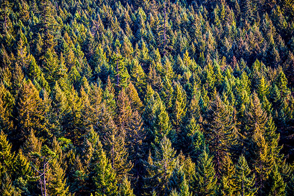
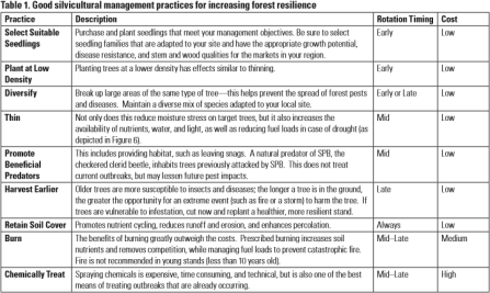
A new guidance factsheet has just been released by North Carolina State University Cooperative Extension that summarizes great work done by the Pine Integrated Network: Education, Mitigation, and Adaptation project (PINEMAP). Healthy Forests:Managing for Resilience includes excellent recommendations on managing pine forests in a changing climate including this guide for silvicultural practices. The factsheet was created with the support of the leadership of the Climate Forests and Woodlands Community of Practice.

Screen Shot 2016-05-05 at 9.38.01 AM.png

The Southeastern Climate Consortium and Florida 4-H have released a Weather and Climate Toolkit for 4-H.While this 133 page document was created for Florida, much of the information is applicable to the Southeast in general and it provides a great background on climate for the 4-H community.