Zinke Confirmation Hearing and What It Means for Our Forests

January 18th, 2017|Tags: |0 Comments

.fusion-fullwidth-1 {
padding-left: px !important;
padding-right: px !important;
}

By Rebecca Turner, American Forests, Senior Director of Programs & Policy

Yosemite National Park

Yosemite National Park. Credit: Yinghai Lu.

We are working with our champions on the Hill to fully vet the cabinet picks that have direct influence over the state of our forests. Yesterday, Tuesday, January 17th, the Senate Committee on Energy and Natural Resources held the confirmation hearing for the Secretary of the Interior nominee, Rep. Ryan Zinke (R-MT).

With the amount of forested land that the Department of Interior manages, it is important to American Forests that the person leading the department is fully versed in the protection and restoration needs of the forests under his or her domain. The Department of Interior oversees the management of 58 million acres of public domain forests, 84.9 million acres of National Parks, of which 55 million acres are in Alaska and heavily forested, and more than 150 million acres of wildlife refuges and wetland management districts which also include forests.

Congressman Zinke’s appointment as Secretary of the Interior is one of the least controversial put forward by President-elect Trump, and while he supports many items that American Forests cares about, there are still a number of issues that give us pause.

We appreciate his support of the permanent authorization and full funding of the Land and Water Conservation Fund (LWCF), an important piece of conservation legislation that provides funds and matching grants to federal, state and local governments for the acquisition of, and easements on, land and water, in both urban and rural areas. He is a strong advocate for our National Parks, wanting to address the $12.5 billion backlog in maintenance, perhaps through a forthcoming Infrastructure and Jobs bill put forth by the new administration. He claims Teddy Roosevelt as his conservation hero and is against the sale or transfer of our public lands.

However, his responses during the confirmation hearing regarding climate change was a mixed bag. He came out stating that climate change is not a hoax, a position in direct opposition to President-elect Trump. He agrees that it is human caused, and even related a story of watching the glaciers in Glacier National Park literally recede during lunch with his family. But, he put forth the false choice that you cannot address climate change and grow the economy, as well as stating that the science regarding what to do about addressing climate change is unsettled.

While Zinke was non-committal regarding how the increases in funding needed will be garnered, he did indicate his role was to advocate for the Interior budget and its needs. American Forests agrees that the Secretary will need to maintain a commitment to the funding needed for all the agencies to properly restore and manage the forests under the Department’s purview. Zinke will also need to be a strong steward for the restoration of our National Parks, beyond their hard infrastructure needs.

Given how controversial the other cabinet appointments have been, it is very likely that Zinke will be confirmed. Once confirmed, we will work with the Department of Interior to uphold its mission, restore and protect the forests under its purview, as well as advocate strongly against decisions that hurt our forests.

The post Zinke Confirmation Hearing and What It Means for Our Forests appeared first on American Forests.

SNAP E&T Learning Academy Builds National Leadership for the Program

A woman working

States use SNAP E&T programs to prepare individuals for in-demand jobs, help employers find qualified workers and strengthen the state’s economy.

As the labor market continues to strengthen, so too are SNAP Employment and Training (SNAP E&T) programs across the country. Since 2014, FNS has diligently worked with states to grow their SNAP E&T programs and adopt more effective, employer-driven practices that help SNAP participants find not just any job—but a good job that reduces their need for SNAP.

These efforts have been successful. The program has grown to serve more than 1 million SNAP participants each year and more and more states are seeking best practices and expertise on how to build a quality program that gets people jobs. The demand for this program is growing—and rightly so—the SNAP E&T program is one of the strongest assets we have to ensure that every SNAP participant has the opportunity to gain the skills they need to find a good job.

In October, Under Secretary Concannon announced a new initiative aimed at creating the national expertise we need to take this program to scale. This unique project provides an opportunity for 35 individuals to gain technical expertise on SNAP E&T that prepares them to work within their state or across multiple states building job driven SNAP E&T programs.

Today, I’m pleased to announce the selected participants for the SNAP E&T Academy. This year’s class looks outside of the traditional SNAP stakeholders and brings in new voices to the SNAP E&T community. Participants from community colleges, hunger coalitions, state advocacy organizations, local workforce boards, national nonprofits, providers and state SNAP agencies will join their fellow participants to work on individual SNAP E&T projects.  These efforts are designed to develop effective and high-quality SNAP E&T programs in their state or across multiple states. All final participants were selected based on a competitive application process.

We look forward to learning and working with SNAP E&T Academy participants in 2017 as they forge new ground across the country!

Visit the SNAP to Skills site to read more about the 2017 SNAP E&T Academy participants.

How to Eat Sustainably in Winter

January 17th, 2017|0 Comments

.fusion-fullwidth-1 {
padding-left: px !important;
padding-right: px !important;
}

By Doyle Irvin, American Forests

One of the most effective ways to live a more sustainable lifestyle is to eat foods grown locally, so that you cut out the energy expense involved in getting food into your crockpot. This is easy to do in summer, when farmers flood the markets with all sorts of tasty tomatoes, peppers, apricots, cucumbers, Boysenberries, Elderberries, blackberries, blue — you get it, the list goes on. But, eating locally is not so easy or enticing to do during winter, so American Forests is here to help you out.

The first step is to become aware of what local farmer’s markets, food co-ops, exchanges and CSA’s (Community Supported Agriculture) are around you. A quick google search will help you, and you can also check out Local Harvest.

If you have the presence of mind, you can preserve your food during warmer months by either canning it or freezing it. The National Center for Home Food Preservation has a bevy of resources on how to do this.

If you’re like me and often lack the foresight to preserve your own food, and find yourself idling at the grocery store on your way home from work, wondering whether cabbage is a seasonal vegetable or flown in from Chile, well, here is the research to help you choose seasonal vegetables.

Roots and sprouts are good!

Onions, potatoes, rutabagas, beets, parsnips, carrots, squash and, yes, cabbage — these are all seasonal during the wintertime. Brussels sprouts and broccoli are also winter-appropriate. For most of my life, I had no idea what to do with a rutabaga, but luckily the internet is always ready to weigh in.

Vegetables

Milk, cheese, eggs and meat can all be local.

While chickens do lay less eggs during the winter, they are still laying some eggs. You can find fresh and local dairy, eggs and meat all throughout the winter. If you are struggling to find local varieties, look in the frozen section.

Dairy

Garnish your food with indoor vegetation.

You’re not going to grow a 10-courser in your windowsill, of course, but it is pretty easy to grow microgreens, sprouts and herbs inside your home.

Herbs

Kale is king.

Other salad makings might not be winter-friendly, but ever-trendy kale happens to be the sweetest (least-bitter) when harvested during the winter. Check out this winter salad recipe!

Kale

Craving fruit?

Grapefruit ripens in January! Other winter-fresh sources of vitamin C are Clementines, Mandarins, tangerines and oranges.

Citrus Fruits

The post How to Eat Sustainably in Winter appeared first on American Forests.

Non-condensable Cynicism in Santa Fe

Guest Post by Mark Boslough

The Fourth Santa Fe Conference on Global & Regional Climate Change will be held on Feb 5-10, 2017. It is the fourth in a series organized and chaired by Petr Chylek of Los Alamos National Laboratory (LANL) and takes place intervals of 5 years or thereabouts. It is sponsored this year by LANL’s Center for Earth and Space Science and co-sponsored by the American Meteorological Society. I attended the Third in the series, which was held the week of Oct 31, 2011. I reported on it here in my essay “Climate cynicism at the Santa Fe conference”.

In that report, I described my experiences and interactions with other attendees, whose opinions and scientific competence spanned the entire spectrum of possibility. Christopher Monckton represented one extreme end-member, with no scientific credibility, total denial of facts, zero acknowledgment of uncertainty in his position, and complete belief in a global conspiracy to promote a global warming fraud. At the opposite end were respected professional climate scientists at the top of their fields, such as Richard Peltier and Gerald North. Others, such as Fred Singer and Bill Gray, occupied different parts of the multi-dimensional phase space, having credentials but also having embraced denial—each for their own reasons that probably didn’t intersect.

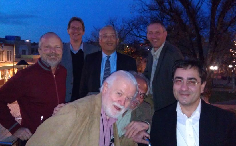
2011 conference participants share a “Christmas in the trenches” moment on the Santa Fe plaza (author on the upper right; Monckton to his immediate left, with Singer just below)

For me, the Third Conference represented an opportunity to talk to people who held contrary opinions and who promoted factually incorrect information for reasons I did not understand. My main motivation for attending was to engage in dialogue with the contrarians and deniers, to try to understand them, and to try to get them to understand me. I came away on good terms with some (Bill Gray and I bonded over our common connection to Colorado State University, where I was an undergraduate physics student in the 1970s) but not so much with others.

I was ambitious and submitted four abstracts. I and my colleagues were pursuing uncertainty quantification for climate change in collaboration with other DOE labs. I had been collaborating on several approaches to it, including betting markets, expert elicitation, and statistical surrogate models, so I submitted an abstract for each of those methods. I had also been working with Lloyd Keigwin, a senior scientist and oceanographer at Woods Hole Oceanographic Institution and another top-of-his-field researcher. We submitted an abstract together about his paleotemperature reconstruction of Sargasso Sea surface temperature, which is probably the most widely reproduced paleoclimate time series other than the Mann et al. “Hockey Stick” graph. I had updated it with modern SST measurements, and in our abstract we pointed out that it had been misused by contrarians who had removed some of the data, replotted it, and mislabeled it to falsely claim that it was a global temperature record showing a cooling trend. The graph continues to make appearances. On March 23, 2000, ExxonMobil took out an advertisement in the New York Times claiming that global warming was “Unsettled Science”. The ad was illustrated with a doctored version of Lloyd’s graph (the inconvenient modern temperature data showing a warming trend had been removed). This drawing was very similar to one that had been generated by climate denier Art Robinson and his son for a Wall Street Journal editorial a couple months earlier. It wasn’t long before other distorted versions started showing up elsewhere, such as the Albuquerque Journal opinion page. The 2000 ExxonMobil version was just entered into the Congressional Record last week by Senator Tim Kaine during the Tillerson confirmation hearings.

Original Keigwin (1996) graph as it appeared in the journal Science.


Doctored Version of Keigwin (1996) graph that appeared in Robinson et al (1998)


Doctored version of Keigwin (1996) graph used in ExxonMobil advertisement.


In 2011, my abstracts on betting, expert elicitation, and statistical models were all accepted, and I presented them. But the abstract that Lloyd and I submitted was unilaterally rejected by Chylek who said, “This Conference is not a suitable forum for [the] type of presentations described in [the] submitted abstract. We would accept a paper that spoke to the science, the measurements, the interpretation, but not simply an attempted refutation of someone else’s assertions (especially when made in unpublished reports and blog site).” The unpublished report he spoke of was the NIPCC/Heartland Institute report, which Fred Singer was there to discuss. After the conference, I spoke to one of the co-chairs about the reasons for the rejection. He said that he hadn’t seen it and did not agree with the reasons for the rejection. He encouraged Lloyd and me to re-submit it again for the 4th conference. So we did. Lloyd sent the following slightly-revised version on January 4.

Misrepresentations of Sargasso Sea Temperatures by Global Warming Doubters

Lloyd Keigwin (Woods Hole Oceanographic Institution) and Mark Boslough (Sandia National Laboratories)

Keigwin (Science 274:1504–1508, 1996) reconstructed the SST record in the northern Sargasso Sea to document natural climate variability in recent millennia. The annual average SST proxy used δ18O in planktonic foraminifera in a radiocarbon-dated 1990 Bermuda Rise box core. Keigwin’s Fig. 4B (K4B) shows a 50-year-averaged time series along with four decades of SST measurements from Station S near Bermuda, demonstrating that at the time of publication, the Sargasso Sea was at its warmest in more than 400 years, and well above the most recent box-core temperature. Taken together, Station S and paleotemperatures suggest there was an acceleration of warming in the 20th century, though this was not an explicit conclusion of the paper. Keigwin concluded that anthropogenic warming may be superposed on a natural warming trend.

In a paper circulated with the anti-Kyoto “Oregon Petition,” Robinson et al. (“Environmental Effects of Increased Atmospheric Carbon Dioxide,” 1998) reproduced K4B but (1) omitted Station S data, (2) incorrectly stated that the time series ended in 1975, (3) conflated Sargasso Sea data with global temperature, and (4) falsely claimed that Keigwin showed global temperatures “are still a little below the average for the past 3,000 years.” Slight variations of Robinson et al. (1998) have been repeatedly published with different author rotations. Various mislabeled, improperly-drawn, and distorted versions of K4B have appeared in the Wall Street Journal, in weblogs, and even as an editorial cartoon—all supporting baseless claims that current temperatures are lower than the long term mean, and traceable to Robinson’s misrepresentation with Station S data removed. In 2007, Robinson added a fictitious 2006 temperature that is significantly lower than the measured data. This doctored version of K4B with fabricated data was reprinted in a 2008 Heartland Institute advocacy report, “Nature, Not Human Activity, Rules the Climate.”

On Jan. 9, Lloyd and I got a terse rejection from Chylek: “Not accepted. The committee finding was that the abstract did not indicate that the presentation would provide additional science that would be appropriate for the conference.”

I had also submitted an abstract with Stephen Lewandowsky and James Risbey called “Bets reveal people’s opinions on climate change and illustrate the statistics of climate change,” and a companion poster entitled “Forty years of expert opinion on global warming: 1977-2017” in which we proposed to survey the conference attendees:

Forecasts of anthropogenic global warming in the 1970s (e.g. Broecker, 1975, Charney et al., 1979) were taken seriously by policy makers. At that time, climate change was already broadly recognized within the US defense and intelligence establishments as a threat to national and global security, particularly due to climate’s effect on food production. There was uncertainty about the degree of global warming, and media-hyped speculation about global cooling confused the public. Because science-informed policy decisions needed to be made in the face of this uncertainty, the US Department of Defense funded a study in 1977 by National Defense University (NDU) called “Climate Change to the Year 2000” in which a panel of experts was surveyed. Contrary to the recent mythology of a global cooling scare in the 1970s, the NDU report (published in 1978) concluded that, “Collectively, the respondents tended to anticipate a slight global warming rather than a cooling”.

Despite the rapid global warming since 1977, this subject remains politically contentious. We propose to use our poster presentation to survey the attendees of the Fourth Santa Fe Conference on Global and Regional Climate Change and to determine how expert opinion has changed in the last 40 years.

I had attempted a similar project at the 3rd conference with my poster “Comparison of Climate Forecasts: Expert Opinions vs. Prediction Markets” in which my abstract proposed the following: “As an experiment, we will ask participants to go on the record with estimates of probability that the global temperature anomaly for calendar year 2012 will be equal to or greater than x, where x ranges in increments of 0.05 °C from 0.30 to 1.10 °C (relative to the 1951-1980 base period, and published by NASA GISS).” I included a table for participants to fill in, and even printed extra sheets to tack up on the board with my poster so I could compile them and report them later.

This idea was a spinoff of work I had presented at an unclassified session of the 2006 International Conference on Intelligence Analysis on my research in support of the US intelligence community for which a broad spectrum of opinion must be used to generate an actionable consensus with incomplete or conflicting information. That was certainly the case in Santa Fe, where there were individuals (e.g. Don Easterbrook) who were going on record with predictions of global cooling. By the last day of the conference, several individuals had filled in the table with their probabilistic predictions and I decided to leave my poster up until the end of the day, which was how long they could be displayed according to the conference program. I wanted to plug it during my oral presentation on prediction markets so that I could get more participation. Unfortunately when I returned to the display room, my poster had been removed. Hotel employees did not know where it was, and the diverse probability estimates were lost.

This year I would be more careful, as announced in my abstract. But the committee would have no part of it. On Jan 10 I got my rejection letter:

I regret to inform you that we have decided to decline this submission.

Based on our consideration of the abstract and plan, it is our view that designing a survey that accurately elicits expert opinion requires special expertise as the answers can depend on how the questions are asked. No indication of such expertise was presented in the abstract itself or found based on examination of your publication record.

A further concern dealt with the proposed comparison with opinion elicited at a different time from a different community by a different method that might allow one to “determine how expert opinion has changed in the last 40 years.”

Concern was raised also over how one might legitimately transform the results of such a poll into “into probabilistic global warming projections.”

Although we cannot accept this poster, we certainly look forward to your active participation in the Conference.

Of the hundreds of abstracts I’ve submitted, this is the only conference that’s ever rejected one. As a frequent session convener and program committee chair myself, I am accustomed to providing poster space for abstracts that I might question, misunderstand, or disagree with. It has never occurred to me to look at the publication list of a poster presenter, But if I were to do that, I would be more thorough and look other information, including their coauthors’ publication lists and CVs as well. In this case, the committee might have discovered more than a few papers by one of them on the subject, such as Risbey and Kandlikar (2002) “Expert Assessment of Uncertainties in Detection and Attribution of Climate Change” in the Bulletin of the American Meteorological Society, or that Prof. Risbey was a faculty member in Granger Morgan’s Engineering and Public Policy department at CMU for five years, a place awash in expert elicitation of climate (I sent my abstract to Prof. Morgan–who I know from my AGU uncertainty quantification days–for his opinion before submitting it to the conference).

At the very least, I would look at the previous work cited in the abstract. The committee would not have been puzzled by how to transform survey data into probabilistic projections if they had done so. They would have learned that the 1978 NDU study we cited had already established the methodology we were proposing to use. The NDU “Task I” was “To define and estimate the likelihood of changes in climate during the next 25 years…” using ten survey questions described in Chapter One (Methodology). The first survey question was on average global temperature. So the legitimacy of the method we were planning to use was established 40 years ago.

I concluded after the 3rd Santa Fe conference that cynicism was the only attribute that was shared by the minority of attendees who were deniers, contrarians, publicity-seekers, enablers, or provocateurs. I now think that cynicism has something in common with greenhouse gases. Cynicism begets cynicism, to the detriment of society. There are natural-born cynics, and if they turn the rest of us into cynics then we are their amplifiers, just like water vapor is an amplifier of carbon dioxide’s greenhouse effect. We become part of a cynical feedback loop that generates distrust in science and the scientific method. I refuse to let that happen. I might have gotten a little steamed by an unfair or inappropriate rejection, but I’ve cooled off and my induced cynicism has condensed now. I am not going to assume that everyone is a cynic just because of a couple of misguided and misinformed decisions.

As President Obama said in his farewell address, “If you’re tired of arguing with strangers on the Internet, try talking with one of them in real life.” So if you are attending the Santa Fe conference, I would like to meet with you. If you are flying into Albuquerque, where I live, drop me a line. Or meet me for a drink or dinner in Santa Fe. I can show you why Lloyd’s research really does provide additional science that is relevant to the conference. I can try to convince you that prediction markets are indeed superior to expert elicitation in their ability to forecast climate change. Maybe I can even talk you into going on record with your own probabilistic global warming forecast!

Lunchtime: Small Changes – Healthy Rewards

MyPlate New Year's Challenge Week 3 graphic

Welcome to Week 3 of the #MyPlateChallenge!

Welcome to Week 3 of our 5-week MyPlate New Year’s Challenge! Last week we focused on the Fruits Food Group and healthy solutions for breakfast. There are still three weeks remaining in the Challenge and it isn’t too late to join – sign up today and invite others to participate with you. This week, we will focus on the Vegetables Food Group and how small changes during lunch can help add more vegetables to your day.  The winner of the Week 3 challenge will be announced on Monday, January 23rd, so make sure you check in to see if you secured the top spot!

Any vegetable or 100% vegetable juice counts as a member of the Vegetable Group. Adding vegetables to your meals can help you feel full with fewer calories. Also, higher intakes of vegetables have been associated with a reduced risk of many chronic diseases including heart disease and cancer. When shopping for frozen or canned vegetables, use the label to look for vegetables without added sauces, gravies, butter, or cream and for “reduced sodium” or “low sodium” or “no salt added” options. Choosing a variety of vegetables throughout your day (and week) will provide you with a range of nutrients. And remember to make time for physical activity!

Lunchtime is a perfect opportunity to include more vegetables in your day and help you earn points in the MyPlate New Year’s Challenge. For example, instead of having a bag of chips with a sandwich, try a side of baby carrots which are just as crunchy but lower in calories, saturated fat, and sodium. Another tip is to add extra vegetables next time you make a soup or stew for dinner, and save a portion for lunch the next day. Packing your lunch is not only a timesaver on busy days; it’s also a cost saver over purchasing lunch on the go.

Check out our video for more ideas to Make Small Changes at Lunch:

MyPlate has several resources to help you make small changes that add up to long-term solutions for healthy eating, such as USDA’s recipe website, What’s Cooking? USDA Mixing Bowl, and our new Make Small Changes webpage that provides healthy eating solutions for every meal. Check out our tips for adding vegetables to your days well as those for eating at an Italian restaurant, in the dining hall, or at a potluck. And remember to share your own tips and real solutions for healthy eating in 2017 using #MyPlateMyWins.

For more healthy eating tips and resources, visit ChooseMyPlate.gov, follow MyPlate on Facebook and Twitter, join or use SuperTracker, and sign up for email updates.

The NASA data conspiracy theory and the cold sun

When climate deniers are desperate because the measurements don’t fit their claims, some of them take the final straw: they try to deny and discredit the data.

The years 2014 and 2015 reached new records in the global temperature, and 2016 has done so again. Some don’t like this because it doesn’t fit their political message, so they try to spread doubt about the observational records of global surface temperatures. A favorite target are the adjustments that occur as these observational records are gradually being vetted and improved by adding new data and eliminating artifacts that arise e.g. from changing measurement practices or the urban heat island effect. More about this is explained in this blog article by Victor Venema from Bonn University, a leading expert on homogenization of climate data. And of course the new paper by Hausfather et al, that made quite a bit of news recently, documents how meticulously scientists work to eliminate bias in sea surface temperature data, in this case arising from a changing proportion of ship versus buoy observations.

To illustrate the shenanigans of self-styled “climate skeptics”, take for example the following graph, which has been circulating for a while on climate denier websites. It beautifully illustrates two of the favorite tricks of climate deniers: cherry picking and deceptive trick graphics.

Fig. 1 Revision history of two individual monthly values for January 1910 and January 2000 in the GISTEMP global temperature data from NASA (Source: WUWT )

If you look at the black arrows, do you have the impression that the 0.71 ° C temperature difference is mainly due to data adjustments? Because the arrow on the right is three times longer than that on the left? Far from it – can you spot the trick? In the vertical axis, 0.3 ° C is missing in the middle! The adjustment is actually only 0.26 °C. Even that is quite a lot of course – and that’s because it is an extreme example. The January 1910 shown is the month with the second largest downward correction, obviously cherry-picked from the 1,643 months of the data series.

In the annual mean values and particularly for the temperatures since the Second World War, the corrections are minimal, as the following graph shows:

Fig. 2 Revision history of global temperature data set from NASA. Here, too, one can see that in 1910 the greatest correction occurred. (Source: Goddard Institute for Space Studies )

This graph must be familiar to anyone who works with the NASA data, because it is in the notes to the data on the NASA site (even interactive). Incidentally, Gavin already debunked the misleading representation in Fig. 1 last March on Twitter. Anyone who shows you Fig. 1 without also explaining the big picture as shown in Fig. 2 is trying to fool you.

A denier favorite is to suggest that NASA deliberately adjusts temperatures upward to exaggerate global warming. An absurd conspiracy theory, as demonstrated by the basic fact that the net effect of the data adjustments is to reduce global warming. The next figure shows this. If climate scientists were trying to exaggerate global warming they’d show you the unadjusted raw data!

Fig. 3 The NASA data of global temperature compared to the uncorrected raw data (light blue) and two global temperature data sets from other institutes. (Source: Goddard Institute for Space Studies )

It is not surprising that you find such conspiracy theories on Anthony Watts’ sectarian blog WUWT, a place where climate science amateurs present earth-shattering insights to their echo chamber like: The CO2 increase is not due to burning fossil fuels, but to insects! Global warming is caused by the nuclear reactor in the Earth’s core! The warming of Antarctica comes from “waste heat from little pockets of humanity” there! The Greenland ice sheet can be at most 650 years old! (That’s obvious – how could the Vikings otherwise have grown crops there?)

A failed cooling forecast

The claim that the NASA data can’t be trusted has recently turned up at WUWT once again because we had compared these data to a cooling forecast made by two German climate denialists, and the comparison wasn’t exactly looking good for that forecast. Fritz Vahrenholt and Sebastian Lüning, both former employees of Europe’s largest single CO2 emitter RWE, had made this forecast of imminent cooling in their 2012 book “Die kalte Sonne” (The cold sun), where this forecast is shown in relation to the HadCRUT surface temperature data in running mean over 23 months.

So if they don’t like the fact that we compared their forecast to NASA’s GISTEMP data, let’s just do it with the HadCRUT data.

Fig. 4 The “Cold Sun” forecast of Vahrenholt and Lüning compared with global surface temperatures of the British Meteorological Service (HadCRUT data), moving average over 23 months to end of October 2016. Graph: Prof. Stefan Rahmstorf, Creative Commons BY-SA 4.0 .

Hmm. Still not so convincing for the cold-sun forecast.

Thus in defense of their forecast at WUWT, Vahrenholt and Lüning have therefore applied three tricks which reduce the discrepancy of data and forecast.

  1. They are no longer taking a moving average over 23 months but over 37. This reduces the observed warming since 2011 (the start of their forecast period) to the end of the data curve from 0.34 to 0.22 °C.
  2. They now no longer take surface temperatures but satellite data for the troposphere (RSS data). We could say a lot about the problems of these data – but we will leave that to the senior scientists behind the RSS data, Carl Mears, who explains in this video why the surface data are more accurate. Above all, however, only ground-level temperatures are directly relevant to us humans. We tend to dwell on the Earth’s surface and not in high-altitude balloons. The fact that Vahrenholt and Lüning are now suddenly switching from the original surface data in their book to the less accurate and hardly relevant tropospheric data can only have one reason: this makes their forecast look somewhat less wrong. Specifically, it reduces the observed warming further from 0.22 to 0.13 °C.
  3. In their new graph, the forecast curve does not start at the level of the measured data curve in 2011, but has been shifted upwards – so the data don’t stick up so far out of the forecast interval at the end.

But even with these three changes compared to the original forecast graph in The Cold Sun, Vahrenholt and Lüning don’t succeed in preventing the observed temperature curve from rising out of their forecast interval. They try to belittle that with the argument that last month’s value just returns to the top edge of the forcast interval – which is irrelevant, however, because this forecast does not apply to individual months, which are always strongly scattered.

The second step alone – just switching from surface to the satellite data – would not have helped them much by the way, bringing only a reduction from 0.34 to 0.30 °C. One can guess that this is why Vahrenholt and Lüning have also extended the smoothing period from two to three years. But let’s accept this longer averaging period as a legitimate choice, since the forecast applies to the medium-term climate evolution and not short-term fluctuations, so that the latter can be filtered out by smoothing. Using a period of three years instead of just two will take out El Niño better. With the 37 months smoothing period the comparison looks as follows:

Fig. 5 The “Cold Sun” forecast of Vahrenholt and Lüning compared with global surface temperatures of the British Meteorological Service (HadCRUT data), running average over 37 months. Graph: Prof. Stefan Rahmstorf, Creative Commons BY-SA 4.0.

This still clearly falsifies the cooling forecast of Vahrenholt and Lüning.

Conclusion

I have discussed this example here in some detail because it exemplifies the methods of so-called “climate skeptics”. People like Vahrenholt and Lüning trust that a layperson won’t notice their various tricks. An outsider can ultimately hardly recognize these unless he studies intensively the available data and scientific literature. However, applying some common-sense criteria can give a layperson a clear indication of the lack of credibility: the source is a “climate skeptics” website, there is no research institution and no professional climate scientists behind these claims, and there is no peer-reviewed publication with the cooling forecast, rather it is directed exclusively at a lay audience. Finally there is a connection of the authors to the fossil energy business.

As in professional journalism, there are several levels of quality assurance in professional science. A long study and training time, which conveys methods and ethics (like the search for truth and the continuous questioning of own assumptions). The standards of good scientific practice (non-compliance, such as manipulation of data, can cost a scientist their job and future prospects.) The reputation as the greatest asset of the scientist and his research institution, that is rapidly lost when making wrong claims. Peer review, i.e. the critical assessment of scientific publications (and even institutions) by independent third parties (mostly competitors). And last but not least, the culture of critical, open debate, which is very much alive e.g. at conferences, which will quickly identify most problems or mistakes.

None of this is infallible, and professional scientists sometimes make mistakes. For this reason, one should not necessarily believe every individual statement by a scientist, not even each peer-reviewed publication. It is better to base ones assessment on the bigger picture. There is good reason why every few years, hundreds of climate scientists from around the world voluntarily and unpaid tackle the big task of sifting through the scientific literature and debating it and summarizing the state of knowledge in the reports of the IPCC. There has long been an overwhelming consensus about the basic facts of global warming. Anyone who finds serious, defensible counter-evidence would quickly become famous – a place in the top journals Nature, Science or PNAS would be assured. The likelihood that you will find a scientific sensation on a shrill layperson website like WUWT is infinitely smaller than that you are simply being fooled there.

How can we have extreme winter AND global warming??

How can we have “global warming” and still have monster snow storms and frigid winters?  Somehow that never made sense to me, until one day I stumbled upon the answer. How global warming causes extreme weather came to me in a revelation about five years ago from an insurance company, Swiss Re, that had written a report about how climate change effects insurance payouts. Swiss Re is a “reinsurance” company that insures other insurance companies.  “Reality-based” organizations, like the U.S. military, or large insurance corporations that pay out millions of dollars of claims money, tend to focus on pesky details like evidence, cost versus benefit, and their Continue reading How can we have extreme winter AND global warming??

The post How can we have extreme winter AND global warming?? appeared first on The Climate Advisor.

The Cost of Raising a Child

Families Projected to Spend an Average of $233,610 Raising a Child Born in 2015 infographic

Families Projected to Spend an Average of $233,610 Raising a Child Born in 2015.

USDA recently issued Expenditures on Children by Families, 2015. This report is also known as “The Cost of Raising a Child.” USDA has been tracking the cost of raising a child since 1960 and this analysis examines expenses by age of child, household income, budgetary component, and region of the country.

Based on the most recent data from the Consumer Expenditures Survey, in 2015, a family will spend approximately $12,980 annually per child in a middle-income ($59,200-$107,400), two-child, married-couple family. Middle-income, married-couple parents of a child born in 2015 may expect to spend $233,610 ($284,570 if projected inflation costs are factored in*) for food, shelter, and other necessities to raise a child through age 17. This does not include the cost of a college education.

Where does the money go? For a middle-income family, housing accounts for the largest share at 29% of total child-rearing costs.  Food is second at 18%, and child care/education (for those with the expense) is third at 16%. Expenses vary depending on the age of the child.

CNPP Housing infographic

As families often need more room to accommodate children, housing is the largest expense.

We did the analysis by household income level, age of the child, and region of residence. Not surprising, the higher a family’s income the more was spent on a child, particularly for child care/education and miscellaneous expenses.

Expenses also increase as a child ages.  Overall annual expenses averaged about $300 less for children from birth to 2 years old, and averaged $900 more for teenagers between 15-17 years of age. Teenagers have higher food costs as well as higher transportation costs as these are the years they start to drive so insurance is included or a maybe a second car is purchased for them.

Regional variation was also observed. Families in the urban Northeast spent the most on a child, followed by families in the urban West, urban South, and urban Midwest.  Families in rural areas throughout the country spent the least on a child—child-rearing expenses were 24% lower in rural areas than the urban Northeast, primarily due to lower housing and child care/education expenses.

Child-rearing expenses are subject to economies of scale. That is, with each additional child, expenses on each declines. For married-couple families with one child, expenses averaged 27% more per child than expenses in a two-child family.  For families with three or more children, per child expenses averaged 24% less on each child than on a child in a two-child family.  This is sometimes referred to as the “cheaper by the dozen” effect. Each additional child costs less because children can share a bedroom; a family can buy food in larger, more economical quantities; clothing and toys can be handed down; and older children can often babysit younger ones.

CNPP Food infographic

Food costs have decreased over the years thanks to increased efficiency in American agriculture.

This report is one of many ways that USDA works to support American families through our programs and work. It outlines typical spending by families from across the country, and is used in a number of ways to help support and education American families.  Courts and state governments use this data to inform their decisions about child support guidelines and foster care payments.  Financial planners use the information to provide advice to their clients, and families can access our Cost of Raising a Child calculator, which we update with every report on our website, to look at spending patterns for families similar to theirs. This Calculator is one of many tools available on MyMoney.gov, a government research and data clearinghouse related to financial education.

This year we released the report at a time when families are thinking about their plans for the New Year.  We’ve been focusing on nutrition-related New Year’s resolutions – or what we are referring to as Real Solutions – on our MyPlate website, ChooseMyPlate.gov.  This report and the updated calculator can help families as they focus on financial health resolutions.  This report will provide families with a greater awareness of the expenses they are likely to face while raising children.

In addition to the report and the calculator, we also have a dedicated section on ChooseMyPlate.gov that provides tips and tools to aid families and individuals in making healthy choices while staying on a budget. For strategies beyond food, our friends at MyMoney.gov offer a wealth of information to help Americans plan for their financial future.

For more information on the Annual Report on Expenditures on Children by Families, also known as the cost of raising a child, go to: https://www.cnpp.usda.gov/expenditures-children-families-annual-report.

*Projected inflationary costs are estimated to average 2.2 percent per year. This estimate is calculated by averaging the rate of inflation over the past 20 years.

U.S. Department of the Treasury’s MyMoney.gov graphic

Visit the U.S. Department of the Treasury’s MyMoney.gov for more resources to ensure financial well-being this New Year’s season!

A Farewell Message from Secretary Tom Vilsack to Employees

Agriculture Secretary Tom Vilsack behind a row of American flags

Agriculture Secretary Tom Vilsack steps on stage at Bonelli Regional Park.

Today, Agriculture Secretary Tom Vilsack sent the following message to all USDA employees:

I want to take this opportunity on my final day at USDA to express my profound gratitude to the people who work at USDA. Every day, nearly 90,000 people leave their families and the comfort of their home to do the people’s work in the People’s Department. What an amazing job you do each day for the country.

Your work allows America to have the most productive farmers, ranchers, and producers in the world. Your work protects our families from unsafe food and our homes from dangerous forest fires. Your work ensures that struggling families have enough to eat and our school children have more nutritious meals and snacks. Your work protects our soil and water and creates new products in labs and universities that improve our quality of life. Your work reflects the compassion of our country for those in need in other countries. Your work supports the creation of new businesses and guarantees that communities large and small are great places to live, work, and raise families. Your work inspires people all over America to buy local and support agriculture regardless of size or method of production. Your work fights against the destruction of invasive species and diseases while insuring against losses that occur when storms, droughts, and floods occur.

Your work enables all the work just outlined to happen because you are in the background making sure our operations run smoothly, regardless of where in the world they might be. Each of you and those who have come before you are part of an extraordinary group of people who proudly and honorably serve the greatest nation on earth.

I wish each of you all the best. I have been honored to be one of you. I have been honored to serve President Obama and Vice President Biden. I have been honored to serve my country. I will always love the people I worked with at USDA and the people we work for.

Sincerely,

Tom Vilsack

Agencies Making Progress to Connect America

Laying cable to bring broadband to rural communities.

Laying cable to bring broadband to rural communities.

Over the last eight years, our agencies have worked to expand the availability and adoption of broadband in recognition of the increasingly important role that the Internet is playing in every facet of society.

Recognizing the opportunity to marshal resources across the entire federal government, President Obama in March 2015 created the Broadband Opportunity Council, co-chaired by the Secretaries of Agriculture and Commerce, which in August 2015 identified a series of executive actions that could be taken through existing agency programs, missions, and budgets to increase broadband deployment, competition, and adoption.

Today, we are pleased to report that the 25 participating agencies have made considerable progress toward completing their commitments. These actions further the goals of modernizing federal programs to expand program support for broadband investments; empowering communities with tools and resources to attract broadband investment and promote meaningful use; promoting increased broadband deployment and competition through expanded access to federal assets; and improving data collection, analysis, and research on broadband.

Agencies have completed 15 of the 36 action items and have made significant progress toward finishing most of the others. Among the completed tasks include the release of guidance in January 2016 from the Department of Housing and Urban Development (HUD) to its HOME Investment Partnerships Program, Housing Trust Fund, and Community Development Block Grant recipients clarifying that program funds can be used for broadband installation infrastructure and service delivery.  Meanwhile, the Treasury Department clarified that broadband infrastructure and related activities are eligible for the New Market Tax Credit Program and Community Reinvestment Act community development consideration in certain circumstances, expanding options for communities seeking investment sources for broadband projects.

One of the principal objectives in creating the Council was to institutionalize agency consideration of broadband into their broader missions.  Consistent with this goal, agencies also have launched a number of new projects — not included in the Council’s original report — designed in a manner that furthers broadband deployment and adoption.  These include efforts such as the Environmental Protection Agency and USDA’s Cool and Connected program, HUD’s ConnectHome program, and the National Science Foundation’s Smart and Connected Communities program among many others, which are described in the report.

As we move forward, we are confident that these efforts to ensure that broadband availability is an embedded element of these agencies’ policymaking will continue on through the coordination efforts of the Broadband Interagency Working Group, which will be led by NTIA’s BroadbandUSA program and USDA’s Rural Utilities Service (RUS). As part of these efforts, NTIA’s BroadbandUSA program will hold a webinar on January 18 featuring speakers from NTIA, RUS and the Treasury Department’s Office of the Comptroller of the Currency to discuss the Council’s progress and work.

We are proud of the work that the Council has done to expand the reach and use of broadband and are confident that the agencies involved will continue to carry on this important work with the enthusiasm, dedication and expertise needed to ensure its success for the benefit of all Americans.